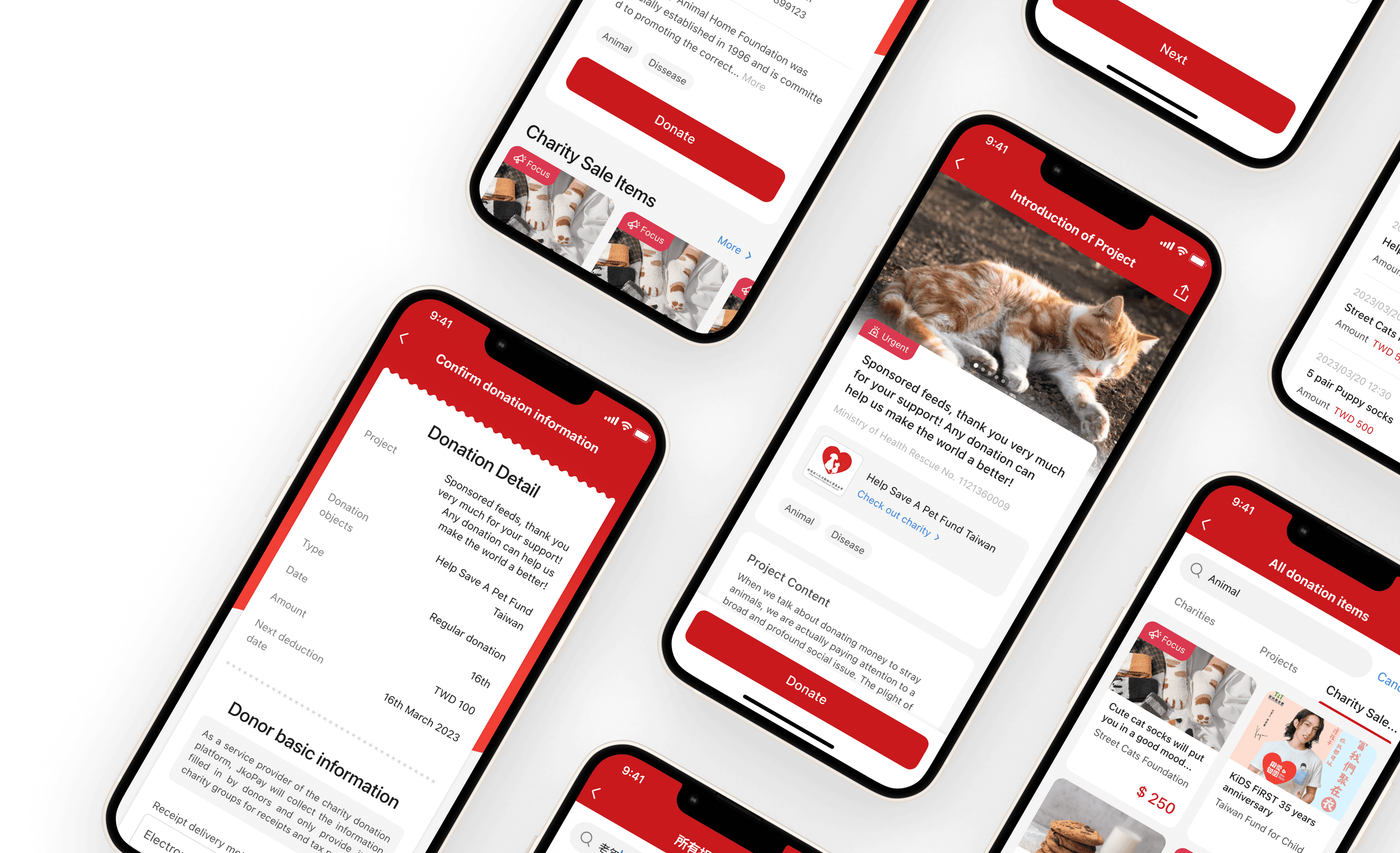


Donation Feature
Revamp
Donation Feature
Revamp
Donation Feature
Revamp
My Role
My Role
UX/UI Designer
UX/UI Designer
Duration
Duration
1 year(2022.12 - 2023.12)
1 year(2022.12 - 2023.12)
Tools
Tools
Figma
Donations Feature:
The highest monthly transaction service in JKOPAY.
Donations Feature:
The highest monthly transaction service in JKOPAY.
In the first half of 2022
$1.75 million
$1.75 million
$1.75 million
Total amount of donation
(US dollars)
Total amount of donation
(US dollars)
Total amount of donation
(US dollars)
100,000
100,000
100,000
The number of
Donation transactions
The number of
Donation transactions
The number of
Donation transactions
31,932
31,932
31,932
Users who donated
at least once
Users who donated
at least once
Users who donated
at least once
Even in the absence of any recurring donation feature on the JKOPAY, nearly 50% of donation users have engaged in donations more than once, and 4% of users consistently donate for six months.
Users who donate consistently for six months have an average donation amount of US$ 225, which is higher than the overall average donation amount for all users, which stands at US$ 55.
Donation service data of JKOPAY in the first half of 2022
Donation service data of JKOPAY in the first half of 2022


Users who donated continuously through JKOPAY
Users who donated continuously through JKOPAY
Users who donated continuously through JKOPAY


About JKOPAY
JKOPay is a well-known electronic payment company in Taiwan, with over 6 million users. JKOPAY offers a variety of financial and lifestyle payment services, including convenience stores, supermarkets, dining, department stores, taxis, food delivery, bill payments, and cross-border e-commerce checkout, among others, within its current scope of services.
JKOPay is a well-known electronic payment company in Taiwan, with over 6 million users. JKOPAY offers a variety of financial and lifestyle payment services, including convenience stores, supermarkets, dining, department stores, taxis, food delivery, bill payments, and cross-border e-commerce checkout, among others, within its current scope of services.
Previous Problems & Design Goals
Previous Problems & Design Goals
Previous Problems
Hard to tell different sections.
Hard to find a specific sort.
The design distinctions between each sections are minimal, making it difficult to discern any differences. As a result, the interface lacks a clear focal point.
Design Goals
Make different sections clearer.
Simplify and expedite the entire donation process.

Donation Projects
Including plenty of words, can’t identify quickly of what is the topic of the project.
Charity List
Can't check any charities unless users enter next page.
Charity Sale Items
Suddenly appearance between projects, might make users confused.
Homepage of donation feature


Homepage of donation feature
Previous Problems
Hard to tell different sections.
Hard to find a specific sort.
The design distinctions between each sections are minimal, making it difficult to discern any differences. As a result, the interface lacks a clear focal point.
Design Goals
Make different sections clearer.
Simplify and expedite the entire donation process.
①
②
③
① Charity List.
Can't check any charities unless users enter next page.
② Donation Projects
Including plenty of words, can’t identify quickly of what is the topic of the project.
③ Charity Sale Items
Suddenly appearance between projects, might make users confused.
Design Process
Wireframe


UI history
Style Discussion
In this redesign, I aimed to evoke a sense of warmth and compassion that aligns with the donation function. Finally, product manager chose our brand color (red) as the final version to enhance our company image, with 2.5D illustration style.
Final Decision


Redesign
Redesign
In this redesign, I did three new features:
In this redesign, I did three new features:
① Search and sort
① Search and sort
① Search and sort
② Provide regular donation
② Provide regular donation
② Provide regular donation
③ Reorganize information level
③ Reorganize information level
③ Reorganize information level


Feature
Feature
1
1
Search and Sort
Search and Sort

Homepage of donation feature

Homepage of donation feature

Homepage of donation feature
Search and Sort functions
Search and Sort functions
Search and Sort functions
Added search and sort functions to help users to find the project they want to donate quickly.
Added search and sort functions to help users to find the project they want to donate quickly.
Easy to see relevant items
Easy to see relevant items
Easy to see relevant items
Through the search and sort functions, users can switch between tabs to clearly see the relevant organizations, projects, and charity merchandise related to the items they want to donate to.
Through the search and sort functions, users can switch between tabs to clearly see the relevant organizations, projects, and charity merchandise related to the items they want to donate to.


search result
search result
search result


indication
clickable
clickable

indication
clickable
clickable
Labels’ indication
Labels’ indication
Labels’ indication
Added sort’s label in project card to indicate users what kind of the project is. Moreover, I also added labels on other pages, and those are clickable, users can click them and go to ‘search result page’ to find other relevant projects.
Added sort’s label in project card to indicate users what kind of the project is. Moreover, I also added labels on other pages, and those are clickable, users can click them and go to ‘search result page’ to find other relevant projects.
Added sort’s label in project card to indicate users what kind of the project is. Moreover, I also added labels on other pages, and those are clickable, users can click them and go to ‘search result page’ to find other relevant projects.
Feature
Feature
2
Provide recurring donation
Provide recurring donation
We offer recurring donations
We offer recurring donations
We offer recurring donations
According to the data, nearly 50% of donation users have engaged in donations more than once, and 4% of users consistently donate for six months.
According to the data, nearly 50% of donation users have engaged in donations more than once, and 4% of users consistently donate for six months.

Donation project
Setting of donation (bottom sheet)
Setting of donation
(bottom sheet)
Setting of donation
(bottom sheet)

Donation project
Setting of donation (bottom sheet)
Setting of donation
(bottom sheet)
Setting of donation
(bottom sheet)

Donation project
Setting of donation (bottom sheet)
Setting of donation
(bottom sheet)
Setting of donation
(bottom sheet)
Feature
2
Provide recurring donation

Donation order detail

Donation order detail

Donation order detail
Only need three steps
Only need three steps
Only need three steps
By providing a more convenient way for donors to set up recurring donations, we expect to boost the overall transaction amount for donations.
By providing a more convenient way for donors to set up recurring donations, we expect to boost the overall transaction amount for donations.
Feature
3
Reorganize information level
Reorganize information level


Feature
3
Reorganize information level


Before
After

After


Before
After

After


Before
After

After
Nonprofit Organizations
Nonprofit Organizations
Nonprofit Organizations
In current version, users can't check any charities unless user enter next page. Now, I display three charities in the first page, it will show randomly and providing users more information.
In current version, users can't check any charities unless user enter next page. Now, I display three charities in the first page, it will show randomly and providing users more information.
Donation Projects
Donation Projects
Donation Projects
I redesign the donation project card, by enlarging the image to catch users’ eyes and making the topic clearly. In addition, if users are lazy to read the whole title sentence, I added the related labels in the bottom of the card, offer more indications to users.
I redesign the donation project card, by enlarging the image to catch users’ eyes and making the topic clearly. In addition, if users are lazy to read the whole title sentence, I added the related labels in the bottom of the card, offer more indications to users.

Before
After


Before
After


Before
After


After

Before


After

Before


After

Before

Charity Merchandise
Charity Merchandise
Charity Merchandise
I move the merchandise to the last sections, because less donors choose to donate merchandise. Besides, I make them scroll horizontal, in order to decline the space that it take but also can see several merchandises.
I move the merchandise to the last sections, because less donors choose to donate merchandise. Besides, I make them scroll horizontal, in order to decline the space that it take but also can see several merchandises.
Figma Prototype
The current online version is in Chinese.
Before
After
Previous Problems & Design Goals
Homepage of donation feature


Donation Projects
Including plenty of words, can’t identify quickly of what is the topic of the project is.
Charity List
Can't check any charities unless users enter next page.
Suddenly appearance between projects, might make users confused.
Charity Sale Items
Previous Problems
The entire interface consists of three components:
Nonprofit Organizations, Donation Projects, and Charity Merchandise. However, the design distinctions between each component are minimal, making it difficult to discern any differences. As a result, the interface lacks a clear focal point.
Hard to tell different sections.
Hard to find a specific sort.
Design Goals
Make different sections clearer.
Simplify and expedite the entire
donation process.
Reflection
Reflection


Donations surged by an impressive 30% compared to the previous monthly average.
Donations surged by an impressive 30% compared to the previous monthly average.
Since this redesign was launched, the donation amount has been increasing every month. In the next step, my goal is to enhance accessibility and usability in our app, considering accessibility from the beginning of the design process rather than as a retrofit. I plan to involve individuals with disabilities in the design process to gain valuable insight.
Since this redesign was launched, the donation amount has been increasing every month. In the next step, my goal is to enhance accessibility and usability in our app, considering accessibility from the beginning of the design process rather than as a retrofit. I plan to involve individuals with disabilities in the design process to gain valuable insight.
Check another project...
Check another project...


SkillRight: Skill-Oriented Friendship App
SkillRight: Skill-Oriented Friendship App
Feel free to contact me 👋🏻
Feel free to contact me 👋🏻
Feel free to contact me 👋🏻
Design Process
Wireframe


UI history
Style Discussion
In this redesign, I aimed to evoke a sense of warmth and compassion that aligns with the donation function. Finally, product manager chose our brand color (red) as the final version to enhance our company image, with 2.5D illustration style.
Final Decision


Design Process

